Agatha H. and the Airship City, A Navel History
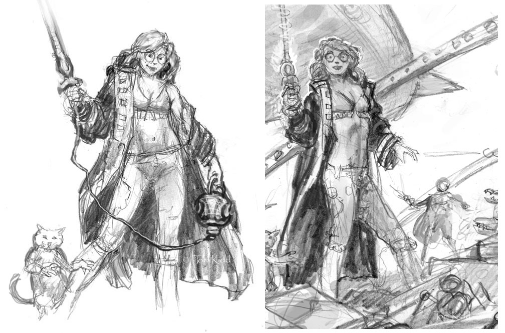
Above are a couple of quick character sketches of Agatha Heterodyne. She’s the main character in Girl Genius. Agatha's normal dress is modest but not always. I figured less was best for the cover.
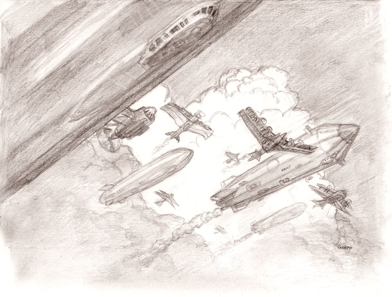
Okay, I admit it I love airships (the picture above was for another book with airships). Give me a book with airships in it and I’m a happy guy. To tell you the truth it’s not that I like gas filled balloons so much it’s that I’ve done the research and I love putting my knowledge to use. Having read a great deal about airships I know that in our present time we underestimate and underutilize this wonderful technology. We seem blind to its potential. As I write this I shake my head in disappointment for us all. It’s shameful.
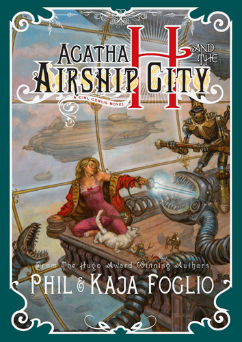
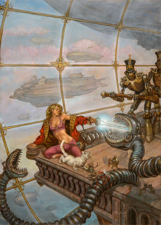
Now that I’ve finished proselytizing I can get to the main thing I’m posting about today. I did the cover to a very well written and entertaining book by Phil and Kaja Foglio. The title is Agatha H. and the Airship City. Above is that cover. It’s likely that you’re familiar with the graphic novel that the book is based on but if not go here.
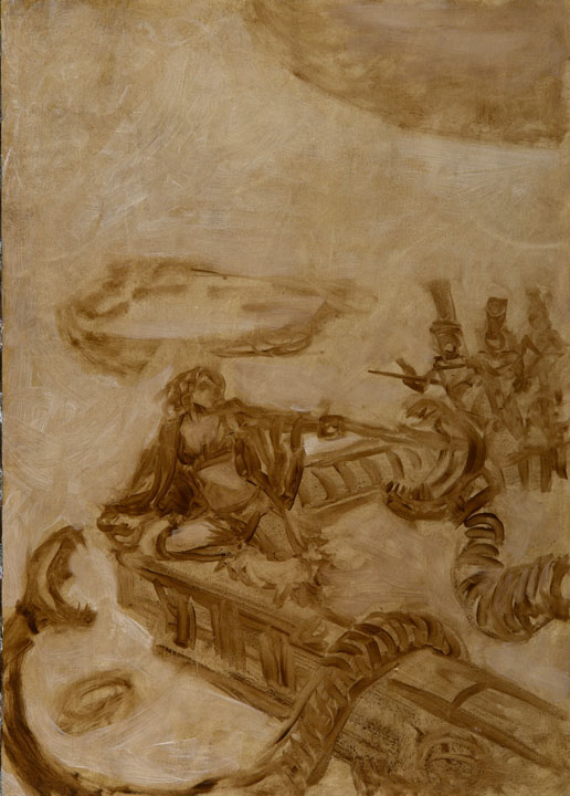
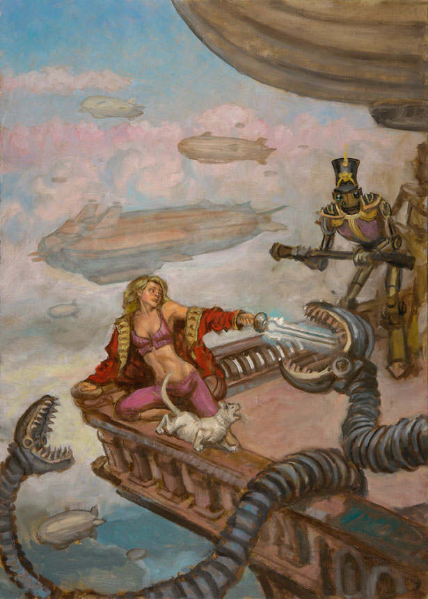
Now to the story of the cover: the art director for Night Shade Books, David Palumbo, contacted me and asked me if I’d like to do the cover. First, the airships – all right! Next, the first book in the series by the Foglios – good deal! I know Phil and Kaja so the pleasure was all mine. It was a mystery to me that Phil wasn’t doing his own cover but that they’d trust me to do it made me feel pretty good. Above is the first stage of painting.
Phil invented some pretty cool machinery and mechanical men so I wanted them to be on the cover. It also had to be an action cover. Agatha had to be there and she had to be beautiful. I figured she should be sexy too. Hey, look at the comic, va-va-va-voom! Above is the next day of painting. As you can see things move fast but then they slow down quick because it took me several days to get to the finish. Note that I move the Wulfenbach troopers, the mechanical men, in closer. Agatha is the center of interest of course.
Above is the cover I first turned in. Here Agatha is dressed in her bedclothes with a coat around her. She makes clockwork men in her sleep and when awoken she is embarrassed to be found dressed skimpily.
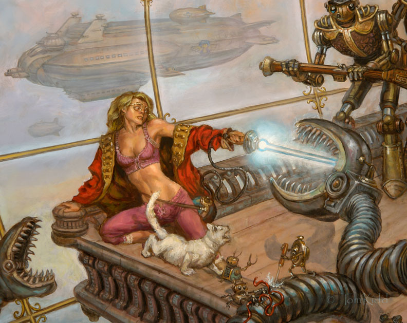
The book is being directed at a general audience, and I believe very much that it will have a wide appeal. This is why I was asked to tone down the cover. My friend Photoshop allowed me to make this change without painting on the original. Although, sadly we've lost Agatha's midriff.
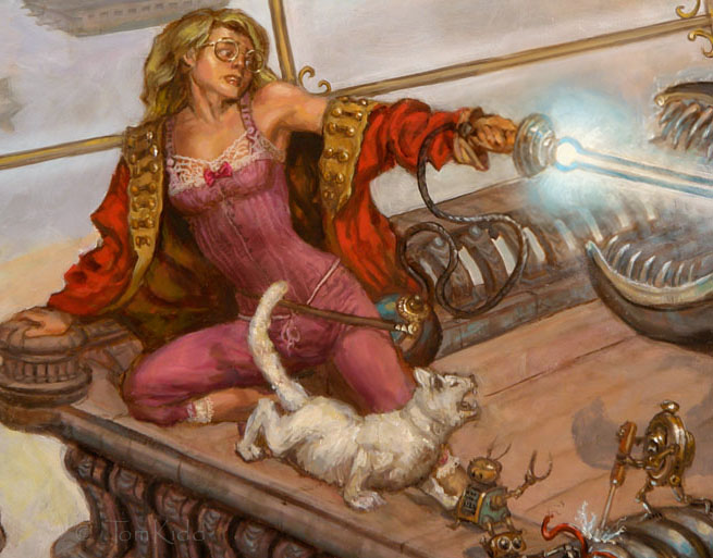
Here in this closeup you can see Agatha's well formed belly, bellybutton and all. This is why my subtitle is "A Navel History." It went away only digitally. Thanks to Photoshop what's gone doesn't have to stay gone. It's almost as if the cat's tail points to it.
PS: By the way, art director at Night Shade is David Palumbo, a fantastic artist himself. Here’s something I didn’t know about David until after I did the cover, he’s Julie Bell’s son (I feel stupid having not known this). I only knew he was a good artist. You probably already know this but Julie Bell is married to Boris Vallejo. Boris’ son is Dorian Vallejo whose work always amazes me. That’s not enough though, Julie has another son, Anthony Palumbo, and he’s an accomplished painter as well. Let’s just call them the fantastic five. The reason I think I don’t know much about other artists’ personal lives is because I’m a paint person and not a people person. I tend to be absorbed in the art and I forget to have curiosity about the artists I know.


20 Comments:
Brilliant post Tom! Love seeing your walkthroughs!
Thanks Aaron. I think I'll take a brief break from the step-by-step stuff and post some drawings next. You likely inspired me here. I really love your drawings and your silhouettes are rather cleverly done. By the way, my blog is in the old form. It needs to be transitioned into the new (new to me) blogger. As soon as I can do this I'll be putting in new links. You'll be one of those. Right now I'm having problems keeping my old ones in the transition. I'm not looking forward to rebuilding them all.
Very kind of you- thanks!
Best of luck with changing the blog over then Tom... sounds like you have issues with technology, like me- dragged kicking and screaming into the modern age!
Aaron, I took a rest from bloggin and I'm trying to get back up to speed. The new version should make it easier to be friendly with people I admire the work of as well as post quicker I think.
Now that I've seen it I can't imagine anyone else doing the cover illustration for a Girl Genius novel.
It's absolutely lovely.
Thanks Gumba. As of today I've started work on the cover for the second book.
Utterly brilliant! I am agog over the airship in the background. Will you be retaining the original painting, give it to the Foglios, or does it belong to the publisher, now? And have you considered a limited edition of prints? (He said, covetously . . .)
"Agatha had to be there and she had to be beautiful. I figured she should be sexy too. Hey, look at the comic, va-va-va-voom!"
*Did* you look at the comic? Your clanks and airships are spot on, but I'm wondering how you missed seeing the main characters anywhere...
"Here in this closeup you can see Agatha's well formed belly, bellybutton and all."
'well formed'... You keep using that word. I don't think it means what you think it means...
While I have no doubt that you probably find the young, chronically malnourished transexual in your painting to be attractive; it runs in direct opposition to the appeal and attraction of the art style of the characters of the parent series. Many of those who are fans of the series are likely to be offended (as am I) by this change, and those who would find the character depiction on this cover appealing will likely not enjoy the art syle of the comic.
While I'm sure that many of the marketing folks would agree that this portayal would appeal to the masses, I would hasten to remind you that "the masses" are not the people who buy steampunk or fantasy novels. Those markets would likely find such character depictions alienating... Pro-ana transexuals aside, of course.
Well, I wouldn't exactly call this figure pro-ana or unfeminine (as per the previous poster)... but I , too, am very disappointed that Agatha was... well, let's call it "mainstreamed"... for this cover.
Don't get me wrong. It's inevitable that a new artist will re-imagine a character to some extent, and that's not necessarily a bad thing. Furthermore, Phil Foglio not only approves of this artist, but had actually intended to request him. And indeed there is a lot to like here.
But for a lot of us, Agatha's new fashion-model build emphatically isn't one of them. And if this change was made specifically in order to appeal to a more mainstream audience... then I have to seriously question its wisdom.
The problem is that Agatha Heterodyne has long been seen as a role-model for this exact issue. The fact that she is a smart, capable, interesting, and attractive person who does NOT have a "model" physique... that's IMPORTANT. Agatha is not svelte and muscular; she's curvy and chunky. She's a REAL PERSON. And that's not only a big part of her charm, it's also a very important statement to make to the readership - especially that portion of it that consists of young girls who might be imagining themselves in Agatha's shoes. (Or her fuzzy bedroom slippers, as it were, in this particular scene.)
And because of this... I have to ask: Why? Why did you as the artist choose to do this? Why did Prof. Foglio choose to approve it (assuming he had power of approval)? Why this particular change, which wipes out an aspect of the character that was so profoundly significant in such a positive way?
I really am asking the question. I would like to know.
Sure, it may reach a larger readership... and sadly, it will encourage that readership to retain its same old harmful prejudices.
It's a lovely painting, and the clanks are beautifully executed... but I wish you'd changed anything about the main character except what you did change. Lose the glasses, dye her hair brown or black or red or purple or checkerboard, okay, I can live with that... but why turn her into a TV aerobics instructor??
That hurts, man. It really does.
Thanks "Soleil" and A Modern Muse for your input. You presume many things that are false. There's no consideration of marketing on my part when I do a cover. I just want to paint a nice painting and represent the book I read well. If I were approached to do a cover to the graphic novel I'd have handled it differently but this was a novel. Have you read it? I went on the descriptions in the book, not Phil's comic, even though I read that too. The definition of well-formed is: correctly or attractively proportioned or shaped.
My complaint about our present society is that people see in terms of symbols rather than with their eyes. Throw out all your preconceived notions and just see. Study nature. Study humans. Study anatomy. Then get back to me with what you've learned or provide me with your credentials. It really takes a great deal of work to see life the way it really is but when you do it's mind expanding, literally. Studies have shown that the human brain actually grows new cells, no matter your age.
Phil's art, in particular his people, are a bit stylized. That's common with comic art. Effectively he's created a different universe. You have to perceive his art as part of that alternate world. How you perceive it is up to you. Is Phil's Agatha zaftig? I disagree if you think she is. With a brief, non-scientific test, showing Girl Genius to friends that have never seen it, they describe Agatha as skinny. Is my Agatha zaftig? She probably wouldn't be described that way but I do accuse Soleil of hyperbole in her description of my Agatha. Exaggeration really doesn't make the point well when there's a picture to compare it to so I'd keep that at bay. If you really feel that way, as a person well-trained at seeing, I have to say you're not seeing well. Science has show that most people really don't see well. Life can be led more efficiently if you break the world down into flash cards but it's not useful when you have to work with the exacting reality of something.
Think about the cartoon character Betty Boop. If an actress were chosen to play her she would have to be a misshapen dwarf to come anywhere near her form. I happily paint people of all shapes and sizes. In school I took twice the required life drawing classes and even now I go to drawing and painting sessions with nude models of all kinds. I've taken the time to learn all the ways that fat forms on the human body. It's rather fascinating to study. If you've never done this I highly recommend it. You'll learn volumes. Seeing well has its benefits.
As to the clanks in the painting, they're terribly out of proportion to Phil's drawings and I even invented new ones. I thought someone would call me on that. Also, the airships are distinctly different that Phil's. I admit to a prejudice here having painted and drawn many airships of my own. Of course these aren't main characters but I thought someone would notice. But, instead, it's typically something shallow.
That anyone perceives a comic character as a "role-model" is interesting. Why is how someone looks so important in our society? Isn't the things they do more important that what nature has given them? I've never understood this. It's shameful. The Agatha you read about in Phil's and Kaja's novel is the same one as in the comic. She's just as heroic whether your perception of her is thin or "chunky."
Oldsarj, thanks for your kind words about my painting.
I have the original. Right now we're in the middle of some changes so the print business is set aside till I can find time to make prints of newer paintings. I think this will all take a year to get settled.
I await with baited breath!
I'm looking forward to getting the book and your cover art.
I had noticed the difference in the airships before reading the comments, but since you've already commented on it there really isn't anything more to say in that regard.
The one critical element that appears to be missing (based on the story line in the graphic novels) is the absence of the Heterodyne choker that keeps Agatha's abilities in check. Not having read the story I can't say it is wrong, maybe there is a point where Agatha is on board an airship without it, but seems an obvious omission based on the graphic novels.
She loses the locket to a thief while still a student at Polygnostic U. She is without the locket for the next several adventures only retrieving it after Lucrezia takes over her mind.
My bad. I had to scan back more than 8 years in the online comic to find the point in time you're talking about. It's hard to believe the story has been running that long, and while I've read every panel published online, I'm afraid I've forgotten many early details, such as the theft of the locket. I'll take your word for when it is recovered, though I thought she actually has it back before that point.
Thanks all. I'm passing my sketched by Phil and Kaja. My hope is they'll catch any mistakes I may make -- and have. I'm working on the second book now but this time I don't have a manuscript. It's in progress. That's actually limiting in that as I read I subconsciously see a movie shot from many different perspectives that I can refer back to later. The important things in a book are noted as I go. Depending on the scene chosen for the cover the locket will return at its appointed time.
I love the cover - interesting to see Agatha drawn more realistically. The only kvetch I have is that Krosp is on all fours, a position he doesn't normally assume. Perhaps under direct threat he reverts to instinct? (As for the different clanks, no one will notice - as Professor Foglio draws them, no two are quite alike.)And there are dingbots .
~ monkeybrain42
I've turned in sketches for the new book. Krops is standing in one and sitting upright in the other. He's wearing his large overcoat as well. Neither sketch could be chosen of course.
One interesting thing about anthropomorphizing cats and other four-legged animals is scapula placement. Humans are distinctly different, they have shoulders with scapula along a plane -- a big disadvantage to running on all fours but that placement make us more flexible in upper body arm movement. We can throw things really well but no amount of training can give that ability to a cat or dog. There are two schools of thought how to handle the problem of anthropomorphizing four-legged animals, the cartoon (Goofy, Tom & Jerry) approach or the Heinrich Kley and A.B. Frost approach.
There are a number of things that can't readily be seen when looking at a painting. One of those is flow. You sense it but it doesn't necessarily register consciously. In this particular scene it works well that I could put Krops on all fours (he starts off a bit more feline in the story) because the twist in his body helps direct the scene. This is one of many layers of thought that go into making a cover painting. One day I should make a list and provide examples of them here.
Dear Mr. Kidd,
Thank you very much for explaining the questions I as well had about the cover. It's kind of you to take the time to go over your decisions on composition and approach - I love learning how people think on matters like this. (And for what it's worth, I really like that first sketch on the left at the top of your post.)
Appreciatively,
Corgi
I'm kinda sad both books show her in skimpy nightgowns. Persisting in depicting her on the cover as helpless and extremely vulnerable because of her abilities instead of the fiery butt-kicker she is the other 90% of the time weakens her in the eyes of potential readers. Also, I thought the tight-fitting jumpsuit style work outfits on Wolfenbach airship were sexy enough. Besides, once she escapes the airship the sudden scandalizing wake-ups don't really happen all that much- show her in Zeetha's training outfit if its absolutely necessary.
Post a Comment
<< Home